I built a COVID-19 website for UNC and UNC's Water Institute
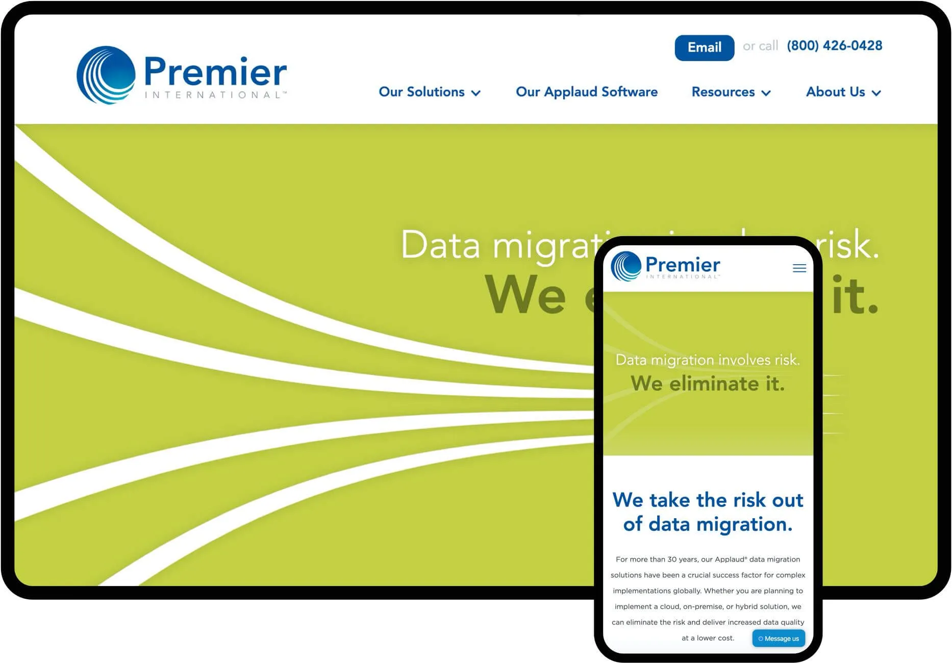
Premier International is consistently ranked as one of the Best and Brightest Companies to work for in Chicago and their original look no longer fit. They wanted a brand and website update to match their growing dominance in the industry.
Logo redesign & branding
Premier wanted to keep the iconic swooshes as a nod to their heritage, so I kept the icon and their signature blue, but reworked their typeface and the icon treatment itself to make the logo design bold and contemporary.

Dynamic branding with "personality sculptures"
To help bring their four brand personality traits to life, I developed a dynamic shape for each using the four swooshes in their logo for brand consistency.
Keeping it all organized with a Brand Guide
After the brand redesign was complete, it was important to tie it all together in an easy-to-follow Brand Guide to distribute to their large team.


Highlighting their playful personality
Forging real relationships and having fun are core elements at Premier. I developed some playful pieces for them to bring this personality into their promotional pieces.

Website design & development
A more dynamic, engaging online experience
Their old web presence felt dated and templated. The experience needed to be rich, captivating and informative while having a professional feel.

A custom website to streamline their marketing plan
Aside from selling their core offerings, Premier also needed a dynamic content management system (CMS) so they could update the website content themselves. This allows them to easily add new articles, job openings and events on the fly, which keeps their site content fresh to support their ongoing marketing efforts and steady growth.
“Adrial is the consummate trusted advisor – he listens to your needs, offers his own ideas and creative genius and then produces an outcome that exceeds expectations. What he did to reinvigorate and refresh the Premier brand has served as a critical launching pad to accelerate our growth and success.”
CRAIG WOOD
CEO, Premier International


